Friday, 23 October 2015
Wednesday, 7 October 2015
Language
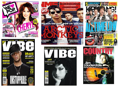
the usual colour schemes of a magazine of this genre is usually dark colours such as reds and blacks. this is because it wouldn't look right if you had bright yellows and pinks to represent this type of genre. this doesn't really appeal to a younger audience of children so they don't really need it to stand out in a way of using the bright vibrant colours. the image placement is usually a medium close up with a direct eye line at the audience this makes it clear for us to see the artist/artists. this fits the convention of most music magazines, not just of this genre. the way the font is also plays a key role. it usually is quite a bold sort of spray paint font to make it seem more urban and relate able to the target audience. the image is usually in black and white in style with the magazine to portray the vintage style of the genre.
Audience
the target audience which will consume this magazine tends to be anyone interested in this kind of music because it is a very specific type of music, so anyone who listens to the genre of music will be interested in this genre of magazine. The language used in magazines of this genre is grown up, it isn't for a younger audience. it is for an audience who want to know more about the artists in their genre and want to know more about the whole genre itself. the magazines in this genre such as NME and Q have a specific manor of using taboo language to really get across the realness of their mag and the artists they are interviewing.
Representation
the genre represents a huge part of music so everything on this magazine has a message and fits the certain codes and conducts of an indie rock magazine. It usually helps gain an audience around the ages of 16-25, so it has quite a varied age to entertain, and that is why it is so popular and successful. As it works when appealing to the 16-25 year old.
Ideology
The ideology of this genre is of the working class British, because these are the classes of the artists which are in the genre. So you have people such as Liam and Noel Gallagher, who are from a working class background and have made it worldwide. So it attracts people of a working class to listen to this music and buy the magazine. The artists in this genre tend to be quite controversial in what they say, so they do get a lot of attention. This also can can cause the audience of the magazine to be controversial and constantly speaking their mind, which isn't necessarily a bad thing but it can cause controversy, which is what some of the artists in this genre are about.
Institution
The institution of these magazines are very clever and analytical when looking at the magazine. They use certain colours to appeal (reds,blacks and yellows), this is because they're bold, like the artists in this genre. They also use very popular bands of the genre as the main image, as it will draw more people in and so they will be more successful, They tend to use bands who haven't produced any music or broken up as the front covers or some story lines, to attract more of an older age group as well as young to buy the magazine. There ultimate goal is to attract as many people to buy the magazines by using specific drawing in techniques such as the bright colour and the world wide bands.
Tuesday, 6 October 2015
GENRE RESEARCH
the iconograohy of the genre that i am doing which is indie rock are very specific to the grnere but they have aspects which are alike to magazines with genres such as Kerrang and Vibe. I belive this is because that the target audience is similair, there isnt a soecific target audience for these specific magazines however it isnt particularly for a young audience of 10 and under so they all have similair codes and conventions. The indie rock magazines usually have a red and black colour scheme running throughout as thye are the colours which are represnted throughout the genre of indie rock magazine
Sunday, 4 October 2015
MY GENRE
The genre I will be basing my magazine on will be indie rock. Firstly because this is the genre of music I listen to so it will be enjoyable and interesting to create. Secondly because I read these kind of magazines so I understand and can fit the conventions of the magazine. Also because I believe that some of the artists in the genre shaped some types of music to what it is today, so it will be nice to try and in cooperate the different eras into this magazine.
Subscribe to:
Comments (Atom)


